
Visualizing Neural Networks
/Tie-Dye Networks are simple graphics that I've found helpful in building visual intuition about what goes on inside neural networks.
One trivial yet deep (pardon the pun) observation on trends in the deep learning community is that architectures are growing ever deeper and wider for increasingly diminished improvements. The latest greatest network ResNet from Microsoft is 150 layers deep. Google's latest architecture Inception version 4 is not quite as deep and easier to visualize (I've tried to squish it for better at a glance viewing), here it is:

So the question I have is: what does the frontier of the space of optimal networks look like, what are the inherent limits of depth vs expressivity of these models, and are there dimensional scaling laws that can describe all this in an information theoretic way? This recent paper gives a great treatment on the expressivity of convolution networks by using a deep layered architecture that generalizes convolutional neural networks called sim-nets. It's worth a read!
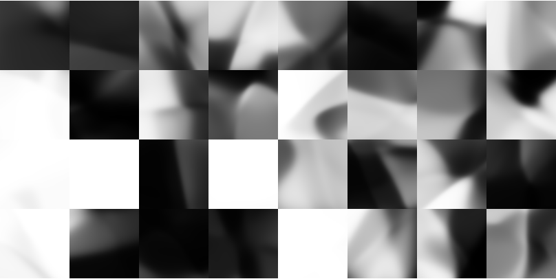
As a simple first step I wanted to see what could be done to visualize the operations a deep neural net performs. So I constructed a standard network that takes vector inputs of size 2 and produces vector outputs of size 3 which we can think of as a mapping of the cartesian plane into RGB color space. Taking many copies of this net and randomly initializing them, (with normally distributed weights and biases) we can plot them in a grid and see the networks' outputs as a set of images. For example, each of the three plots below show 32 random networks each with three fully connected layers, but where the number of hidden units increases from left to right:

(1,1,3) neurons

(10,5,3) NEURONS

(20,10,3) NEURONS
Eventually we reach a three fully connected layers set up like this:

and we have sufficient model complexity in place to achieve tie-dye :)

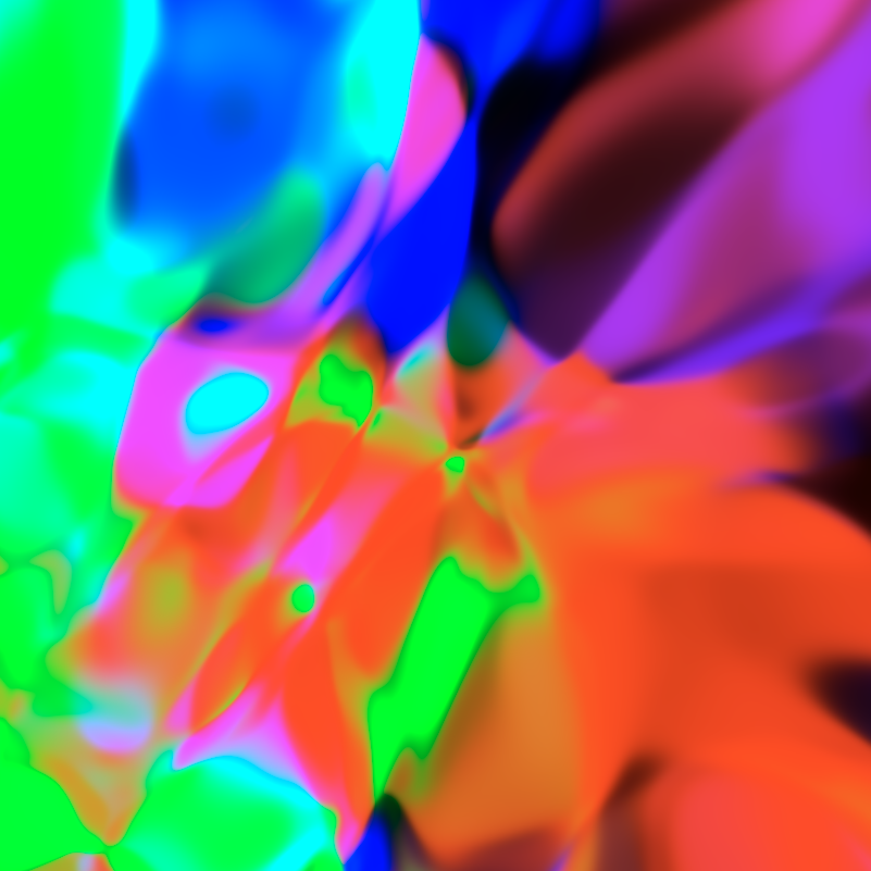
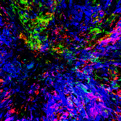
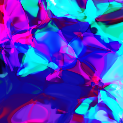
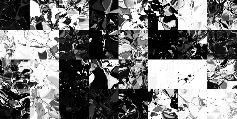
If we continue to stack these layers into deeper networks things start looking a bit incomprehensible

But for lower dimensions we can clearly see how the networks are changing with respect to layer count and neural density independently

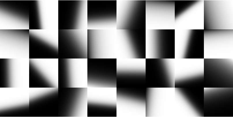
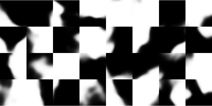
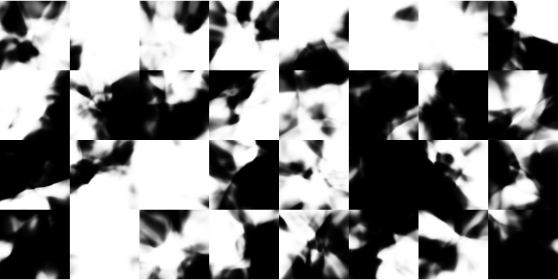
If we treat the outputs as 1 dimensional we get more and more ghostly black and white images
If we extend our analysis to 3 dimensions we can visualize the output with 3D images.


It's hard to see the inner voxels, it's easier to see as animated 2D slice sliding output though the 3rd dimension. Here are shallow and deep (left and right) convnets with 1 output channel:
and again in color (3 output channels):
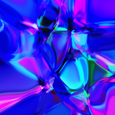
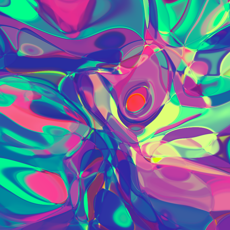
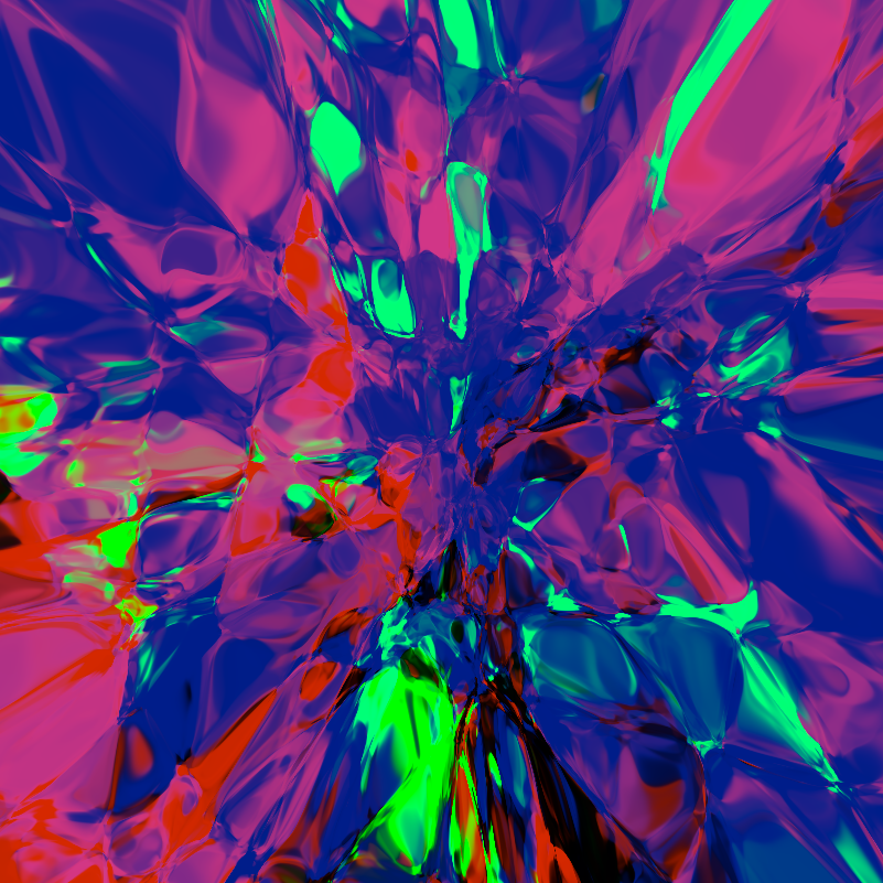
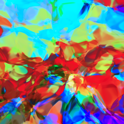
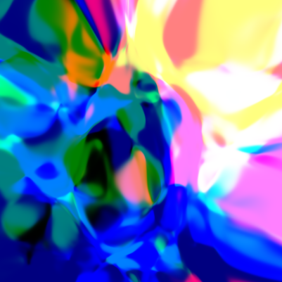
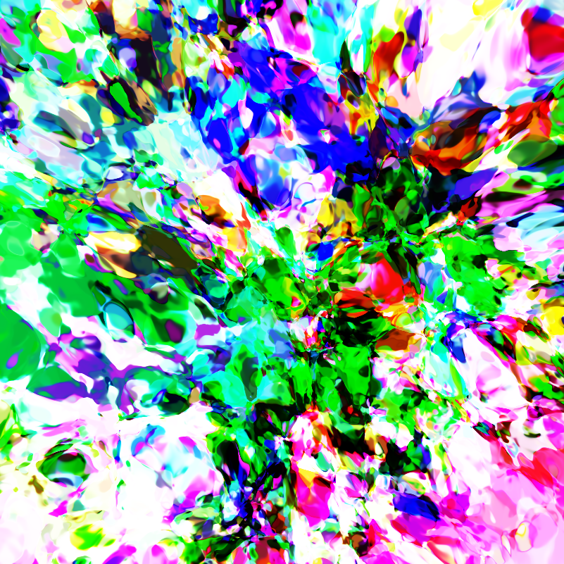
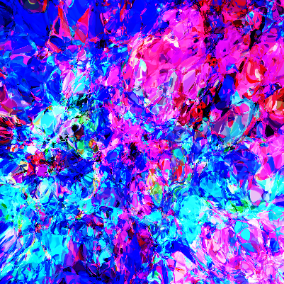
At some level I feel these figures become sort of artistic. Below is a gallery with only a handful of ones I think are particularly awesome: